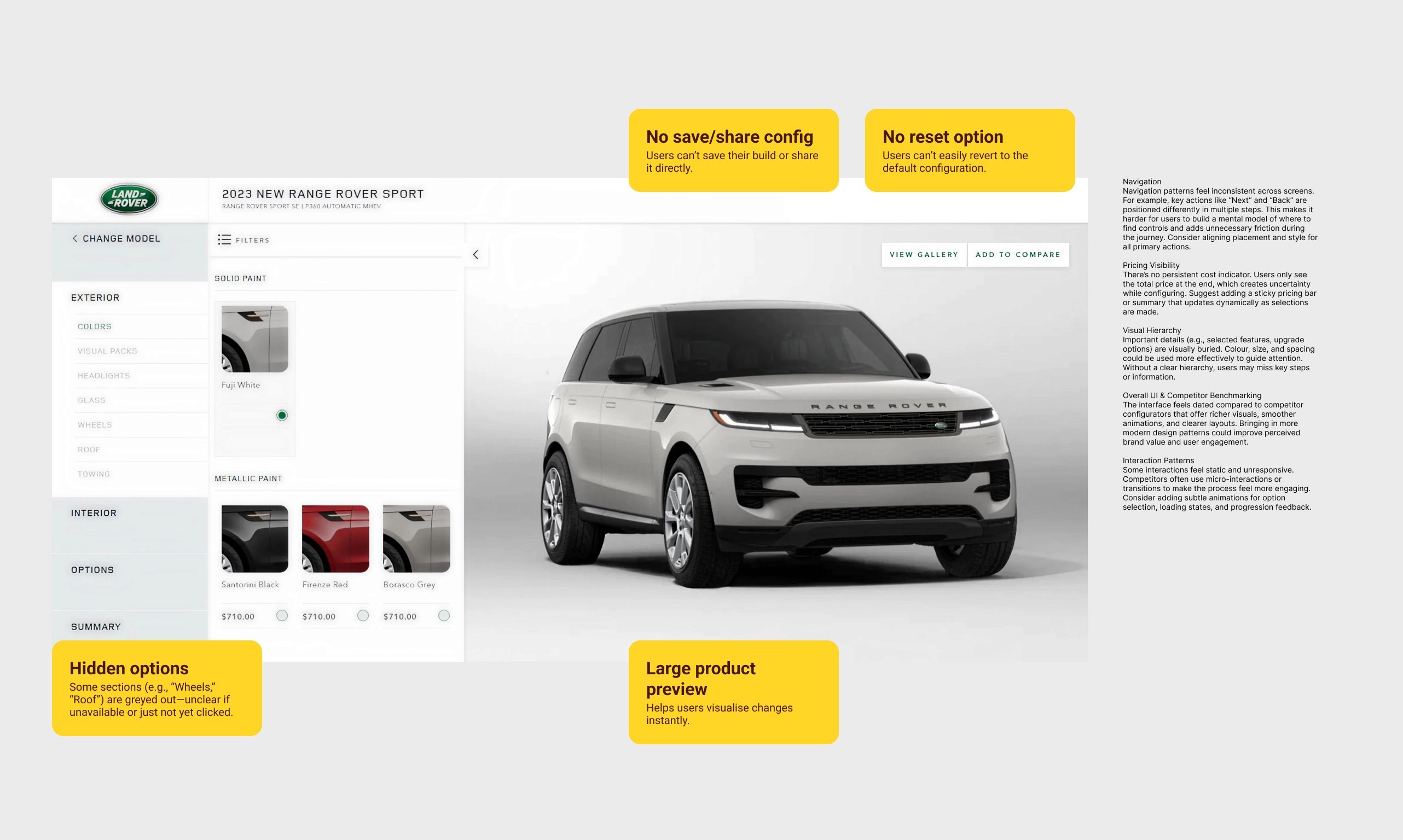
Land Rover came seeking assistance to improve their vehicle configurator following negative customer feedback. The goal was to enhance both UI and UX, addressing pain points that caused user frustration and ensuring the configurator felt as premium and innovative as the brand itself.
User Research
To validate and expand on these findings, I conducted user testing with 10 participants. A mix of existing Land Rover customers and new prospects.
Participants were asked to complete six configuration tasks while their screens were recorded for later analysis.
100%
Surprised by the final value
70%
Found configuring vehicles stressful
60%
Struggled to change selected options
Land Rover has opted to reduce their options to simplify their business operations. The new architecture aims to facilitate customers in navigating the configurator and locating the options that appeal to them.
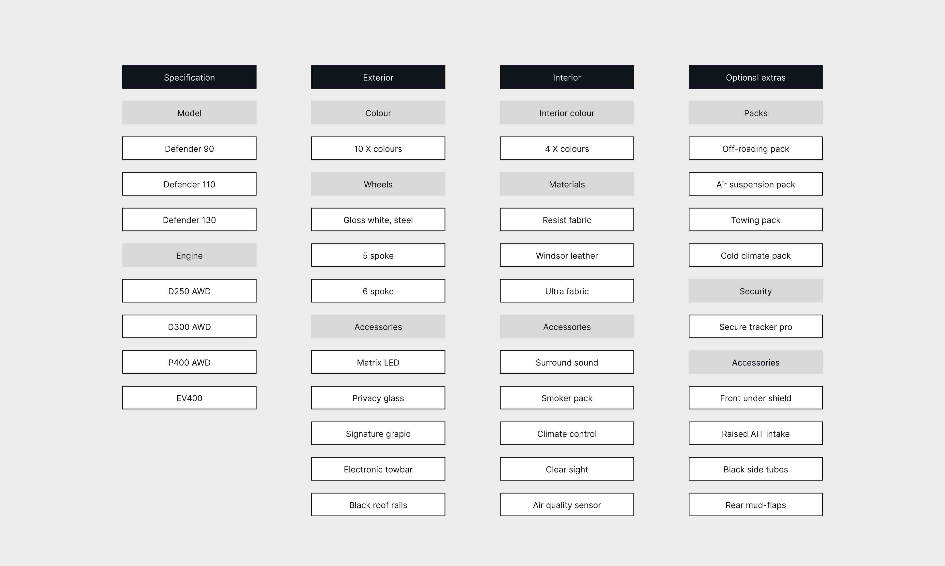
Problem
Balancing simplicity with comprehensive choice was a significant challenge. Reducing the number of available options risked making users feel that their choices were overly limited, potentially impacting their satisfaction.
Potential solution
One approach to address this challenge could be to incorporate extensive educational content within the configurator. This could include comparison tools, detailed explanations of features and options, and high-quality images and videos. By providing clear and comprehensive information, users would be able to make informed decisions confidently. This strategy could ensure that the configurator remains user-friendly and maintains the premium feel of the brand, thereby enhancing overall customer satisfaction despite the streamlined selection process.
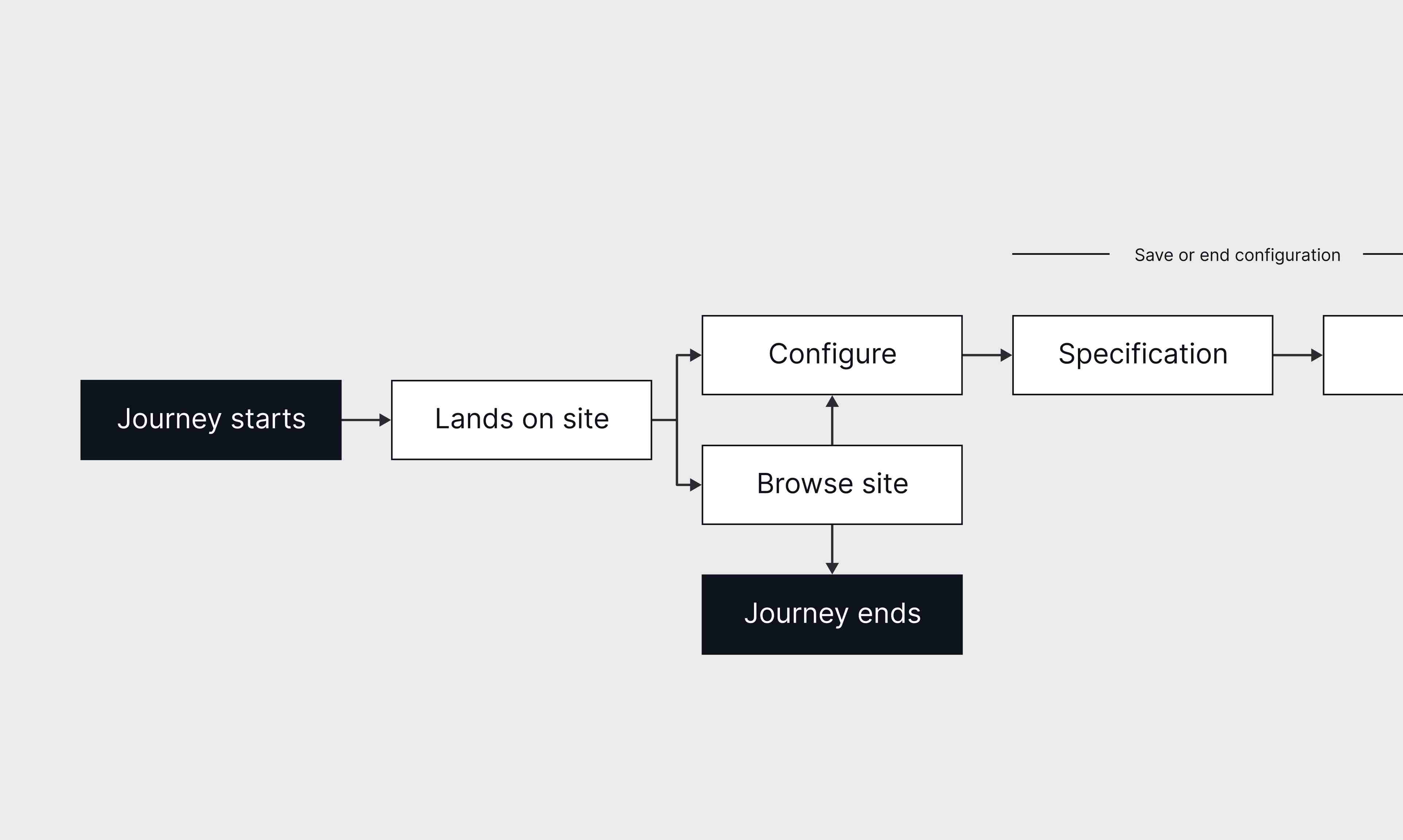
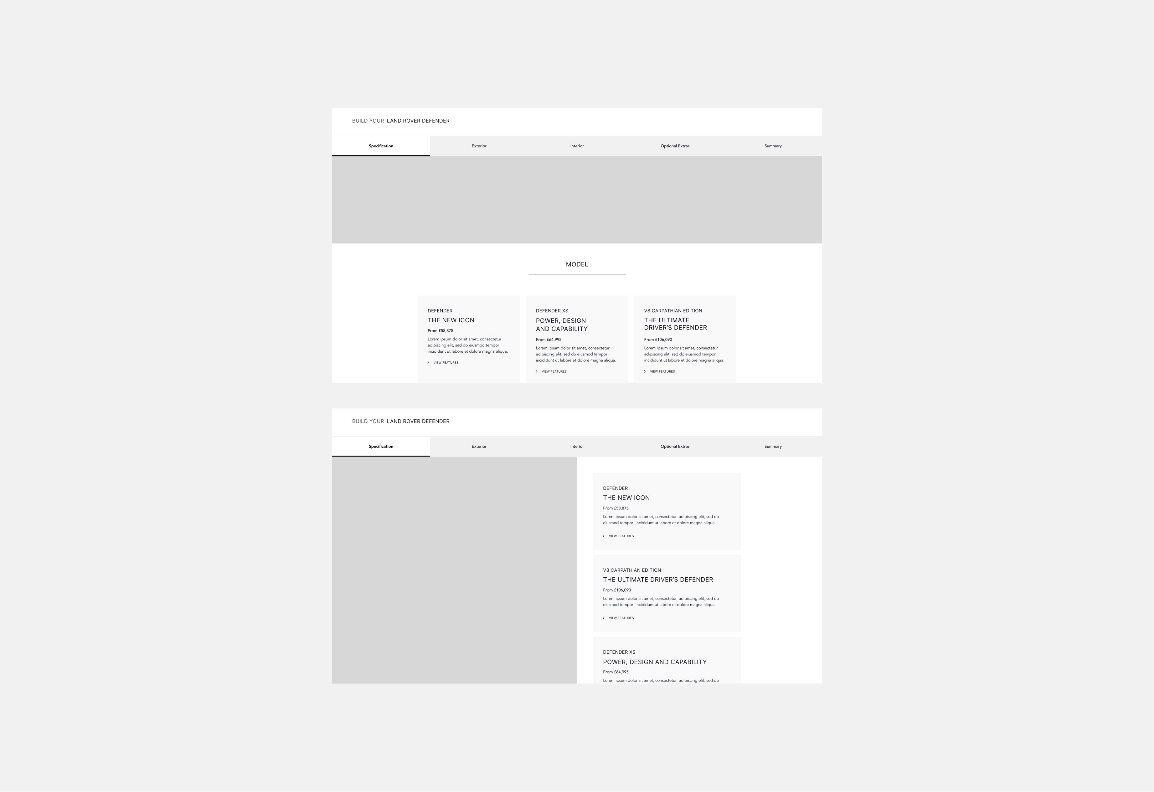
User Flow
Layout Exploration
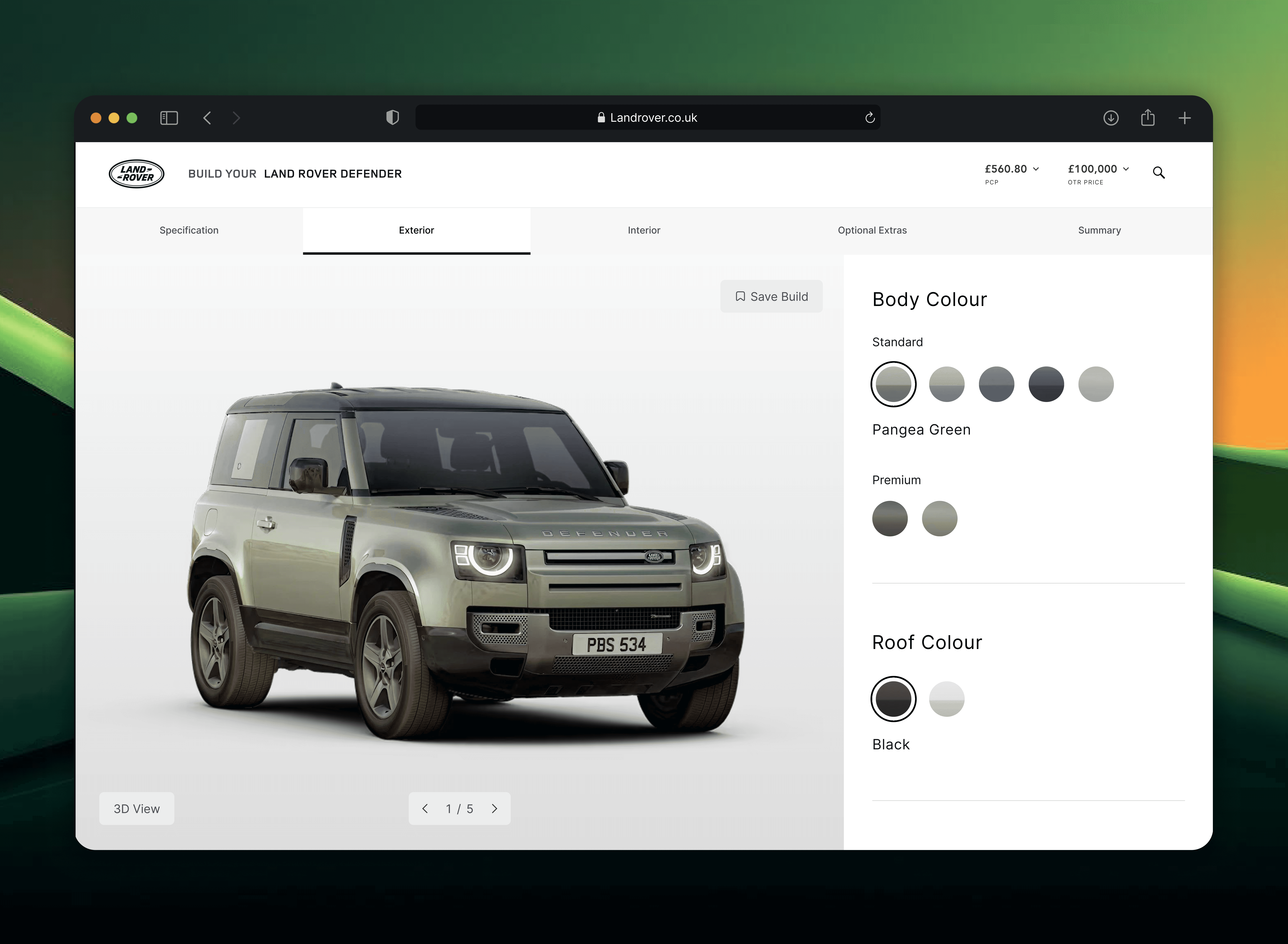
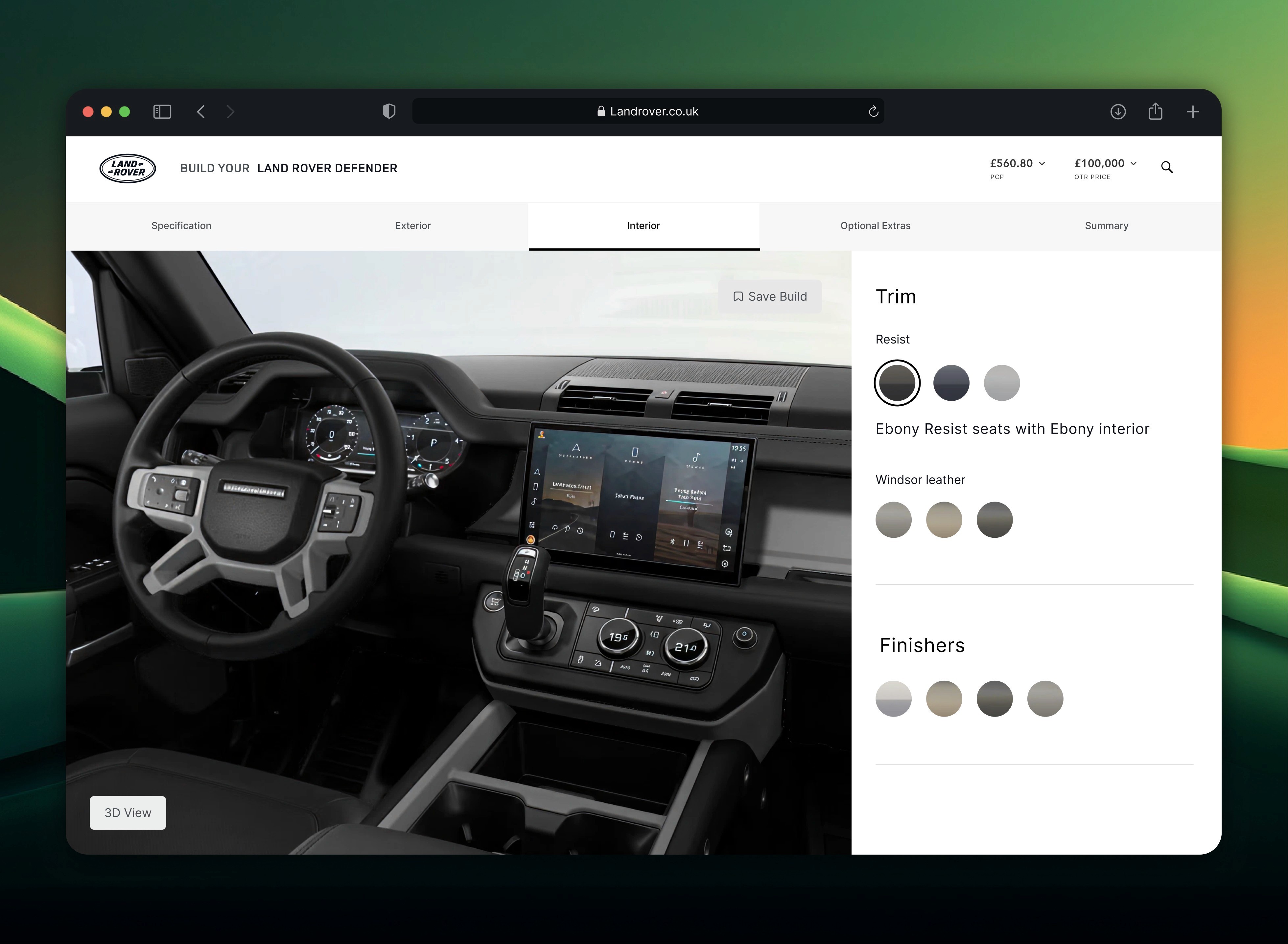
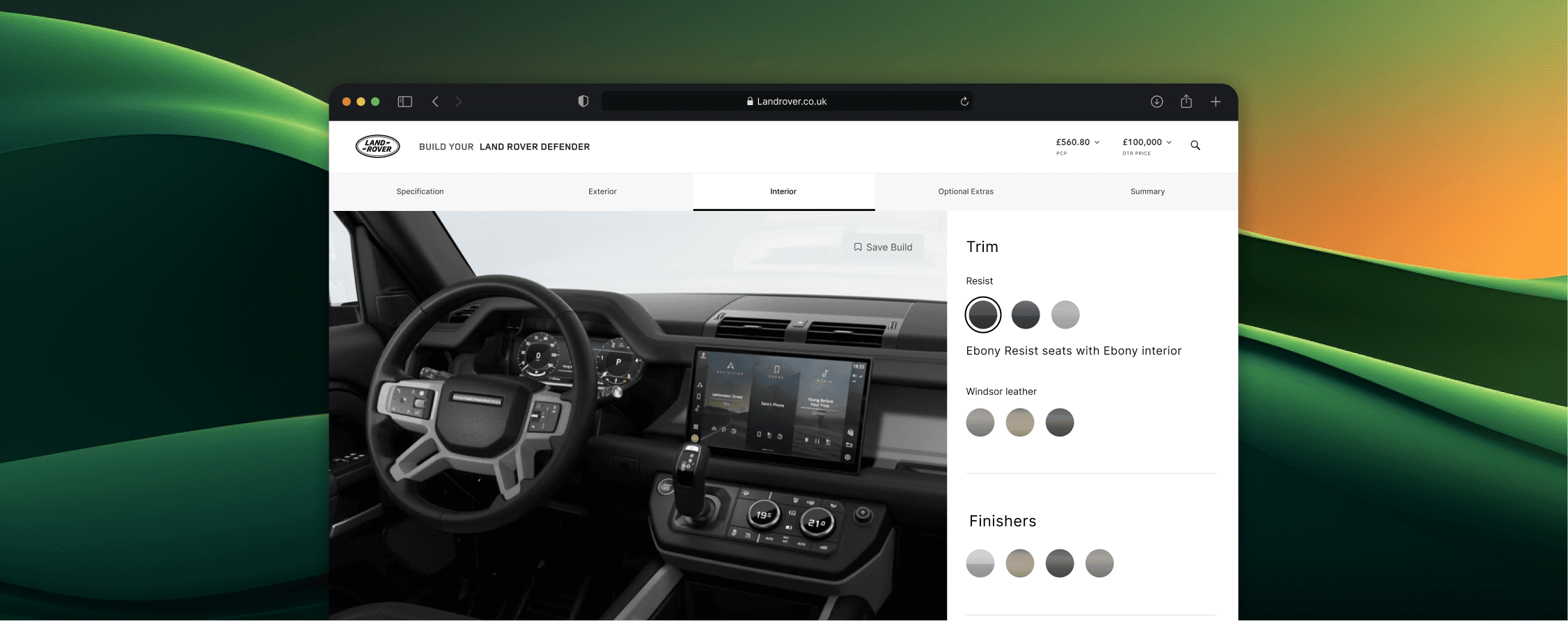
Price
One key pain point identified by the user research was that the price was only available at the end of the journey. To address this issue, the price has been fully integrated and can now be viewed by the user at any stage of their journey.
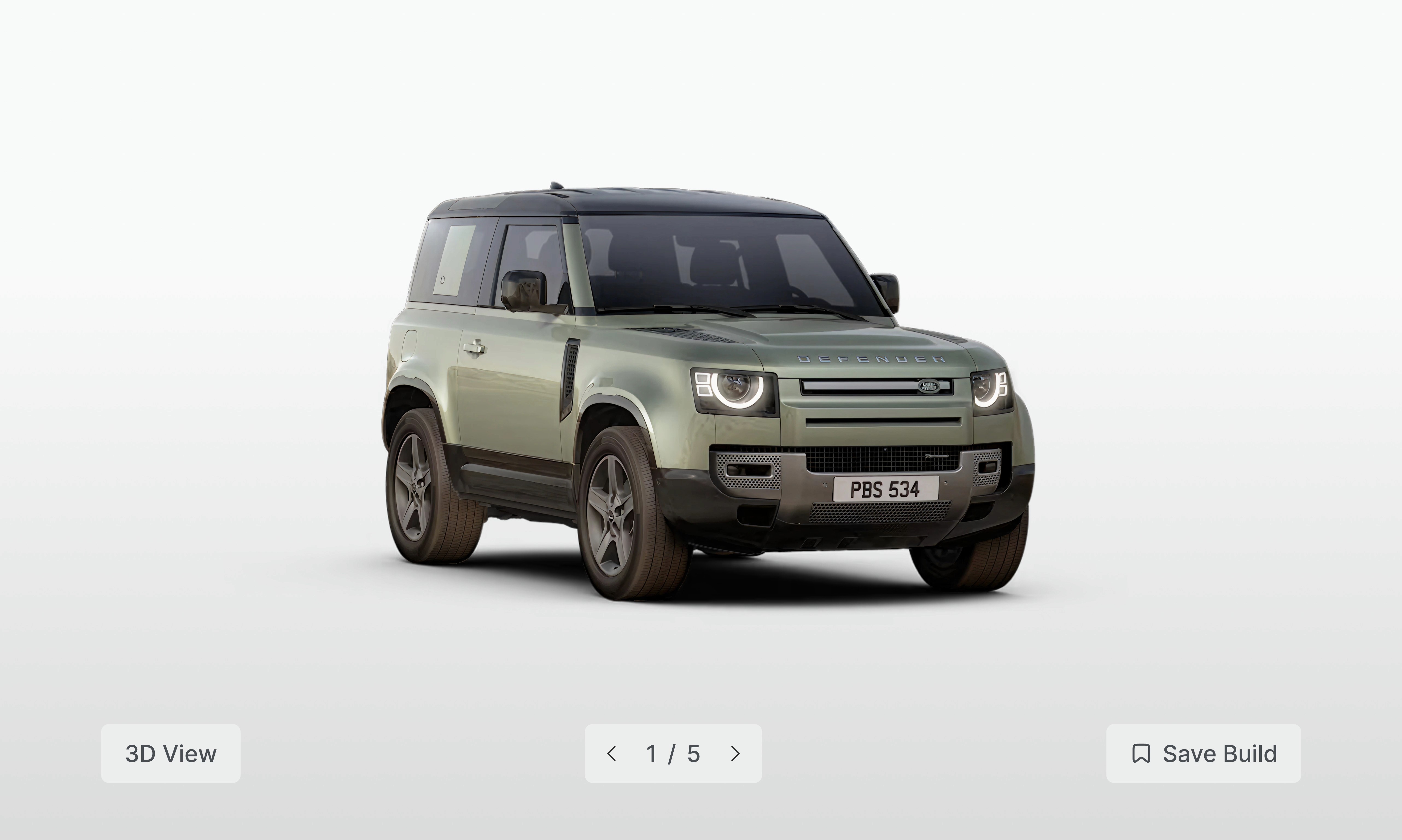
Interactive elements
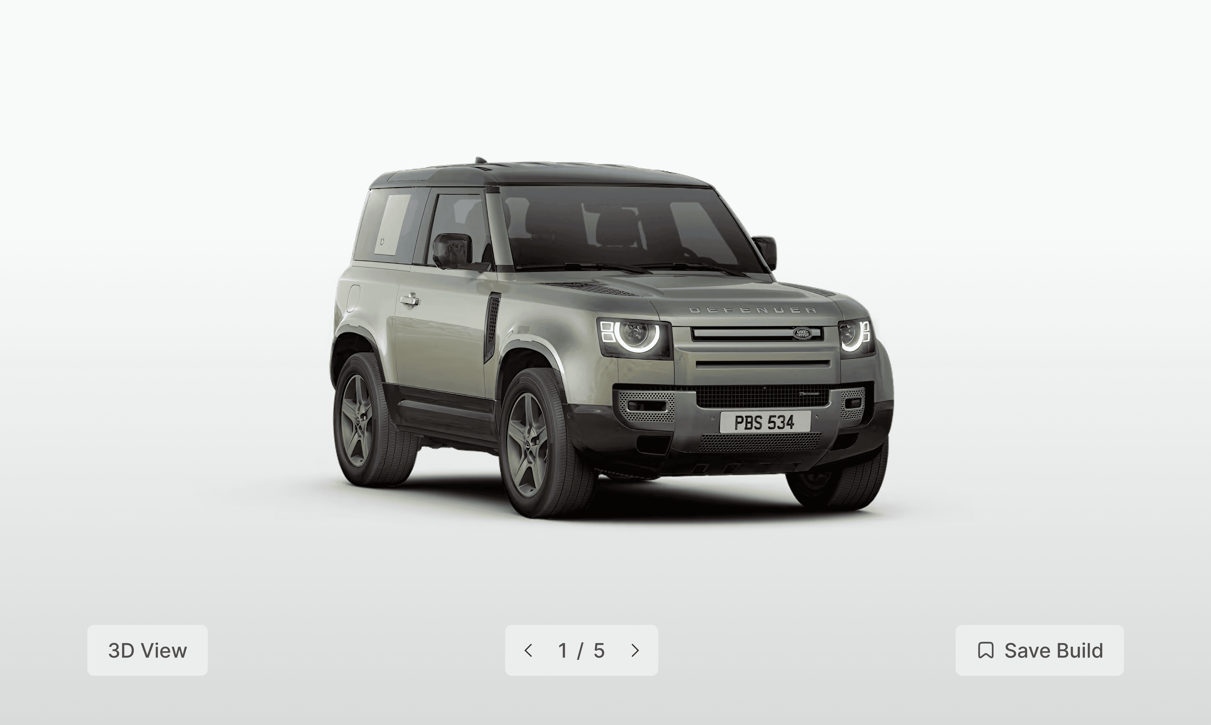
A 3D rendering of the vehicle is now accessible for users to visualise their car. Additionally, users can explore the off-road capabilities of the vehicle by viewing it in various environments and lighting conditions.
Saving a vehicle
Users now have the option to save a vehicle allowing them to return to it at a later stage without the need for a full re-configuration.
User Testing
Evaluation