Smooth Scroll
This will hide itself!

Boots Opticians
Online booking journey

Boots Opticians
Online booking journey

leading UK eye care provider offering eye tests, glasses, and contact lenses.

leading UK eye care provider offering eye tests, glasses, and contact lenses.

leading UK eye care provider offering eye tests,

glasses, and contact lenses.

Introduction

The goal of this project was to redesign the online appointment booking journey to reduce drop-offs and improve conversion.

The original experience lacked structure and clarity, leading to a frustrating user experience, particularly on mobile, and ultimately impacting the number of completed bookings.

Problem

The existing booking journey had several pain points that contributed to user frustration and drop offs.


  • Users were unsure where they were in the process.

  • Login requirements caused unnecessary friction.

  • Store availability was unclear until late in the flow.

  • Mobile users struggled with responsiveness and readability.


Data from Google Analytics revealed a drop-off rate of over 32% between the store selection and confirmation steps, indicating that many users were getting stuck or abandoning the process midway.

The existing booking journey had several pain points that contributed to user frustration and drop offs.


  • Users were unsure where they were in the process.


  • Login requirements caused unnecessary friction.


  • Store availability was unclear until late in the flow.


  • Mobile users struggled with responsiveness and readability.


Data from Google Analytics revealed a drop-off rate of over 40% between the store selection and confirmation steps, indicating that many users were getting stuck or abandoning the process midway.

Reaserch

To understand why users were dropping off, I analysed funnel data in Google Analytics and reviewed appointment booking flows from competitors in the optical and healthcare sectors.


I also gathered insights from internal support and store staff. This combination of quantitative data and qualitative feedback highlighted key usability issues and guided the design direction.
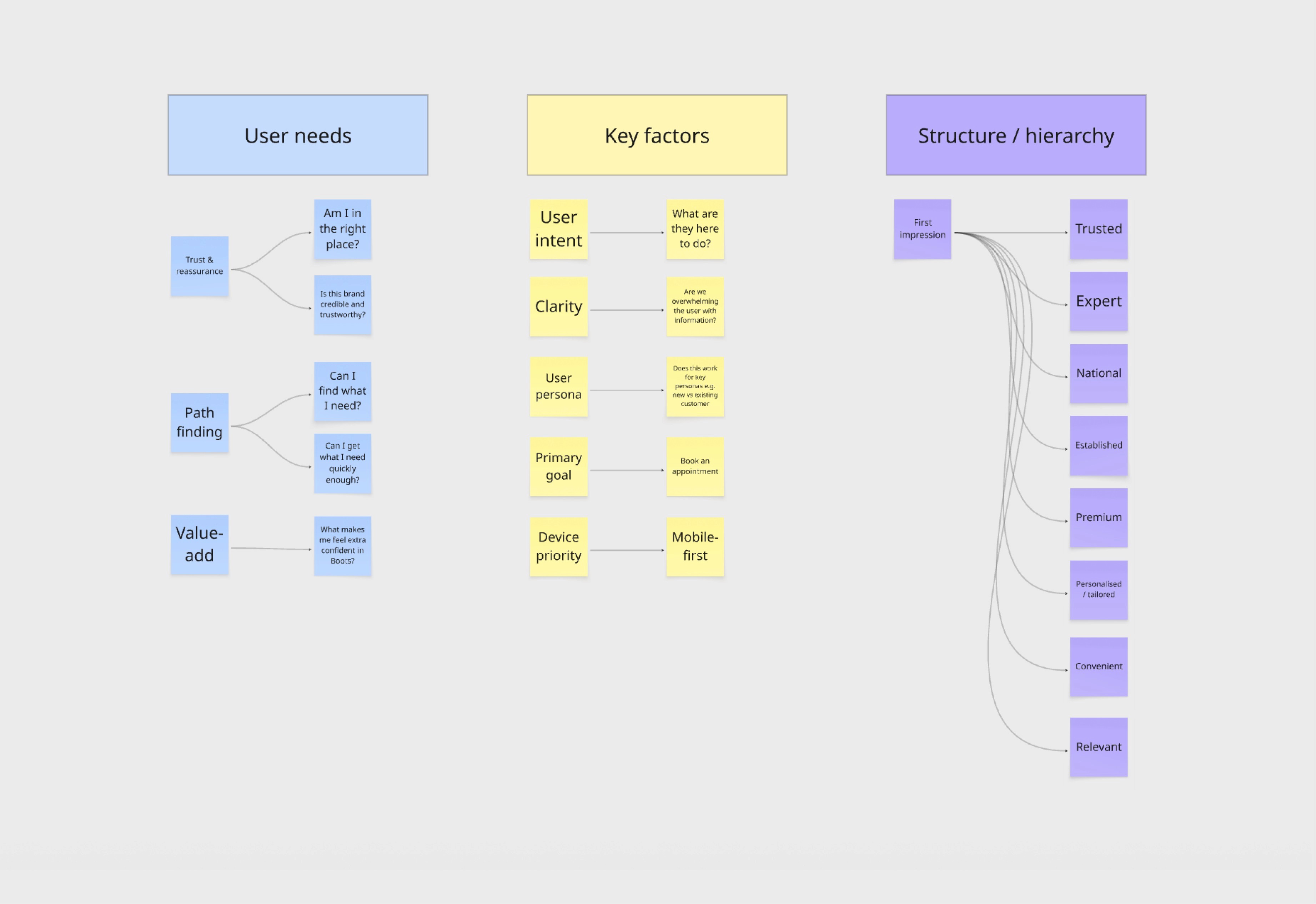
Design Principles

Based on the research, I defined the following principles to guide the redesign:


Clarity

Make the process feel linear, predictable, and transparent.


Flexibility

Cater to both quick bookings and returning users.


Accessibility

Ensure WCAG-compliant design across all devices.


Speed to Value

Surface availability and progress early to reduce friction.

Wireframes

Early concepts tested step by step versus single page journeys.

I experimented with the placement and styling of the progress tracker and prototyped different layouts for displaying store availability and filtering by time and location.

Early concepts tested step by step versus single page journeys. I experimented with the placement and styling of the progress tracker and prototyped different layouts for displaying store availability and filtering by time and location.

Key Design Solutions
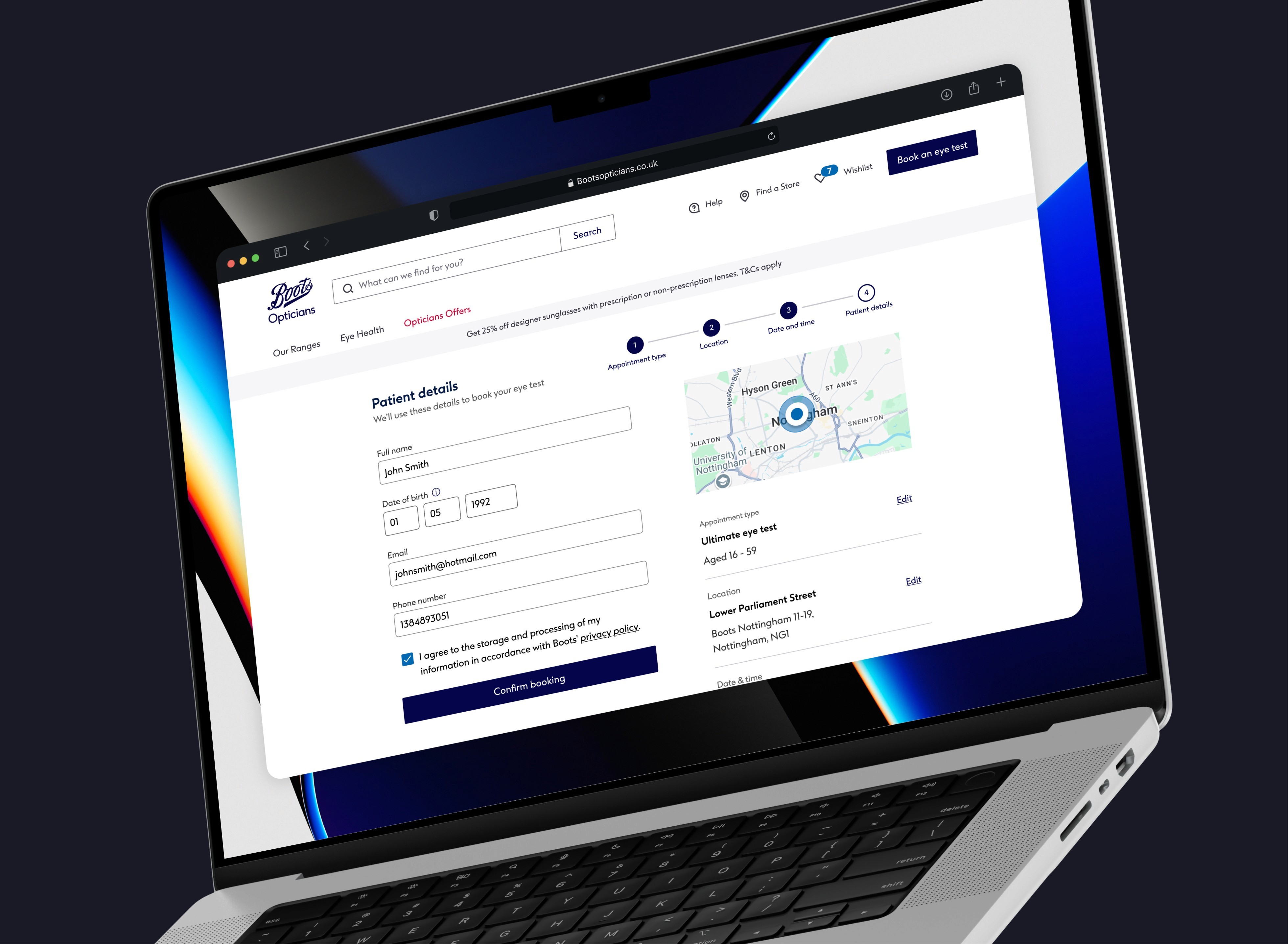
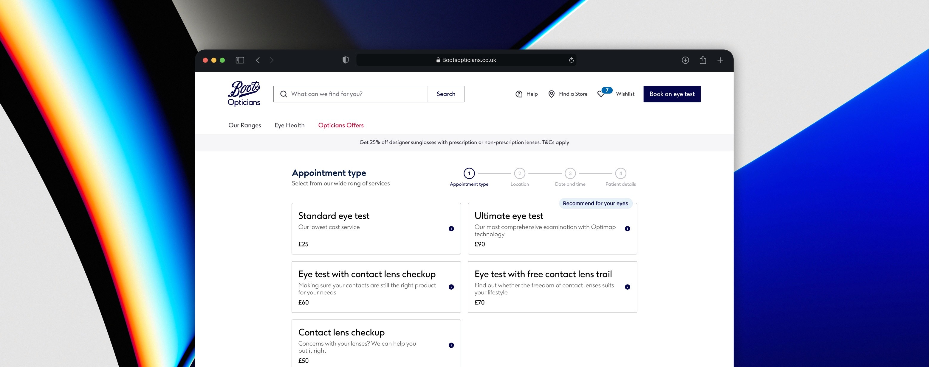
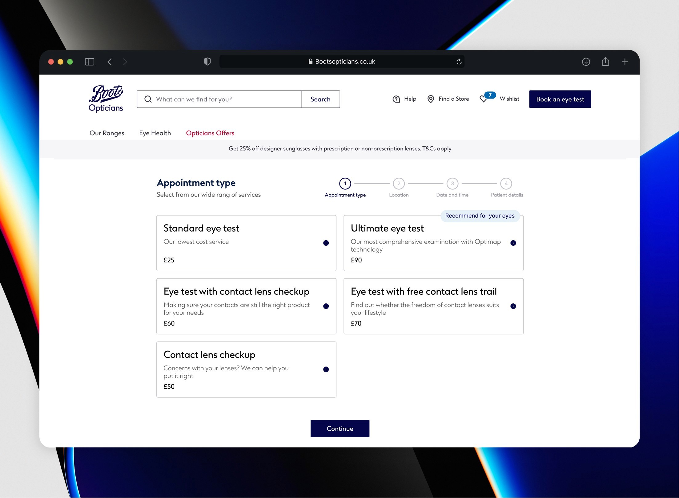
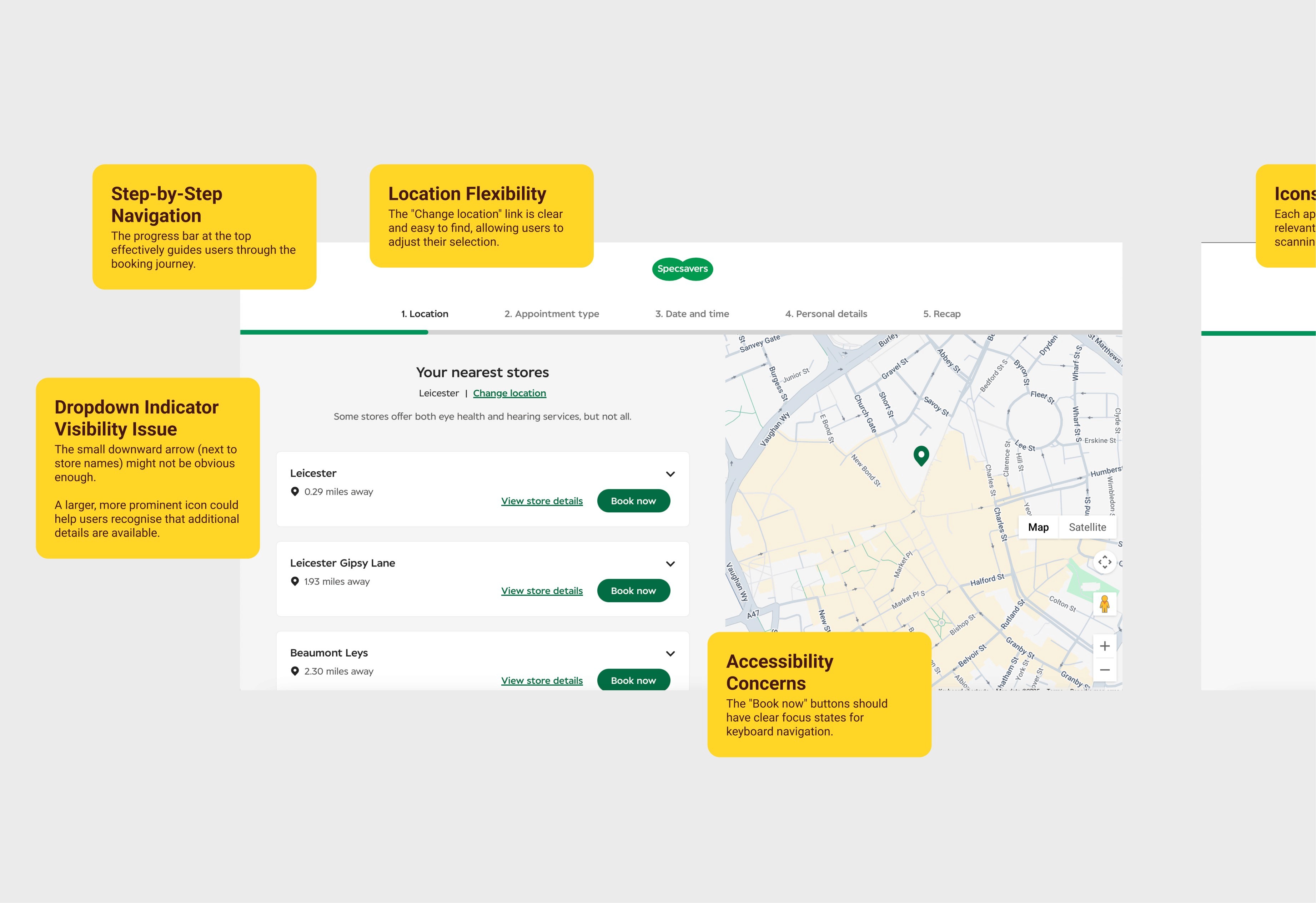
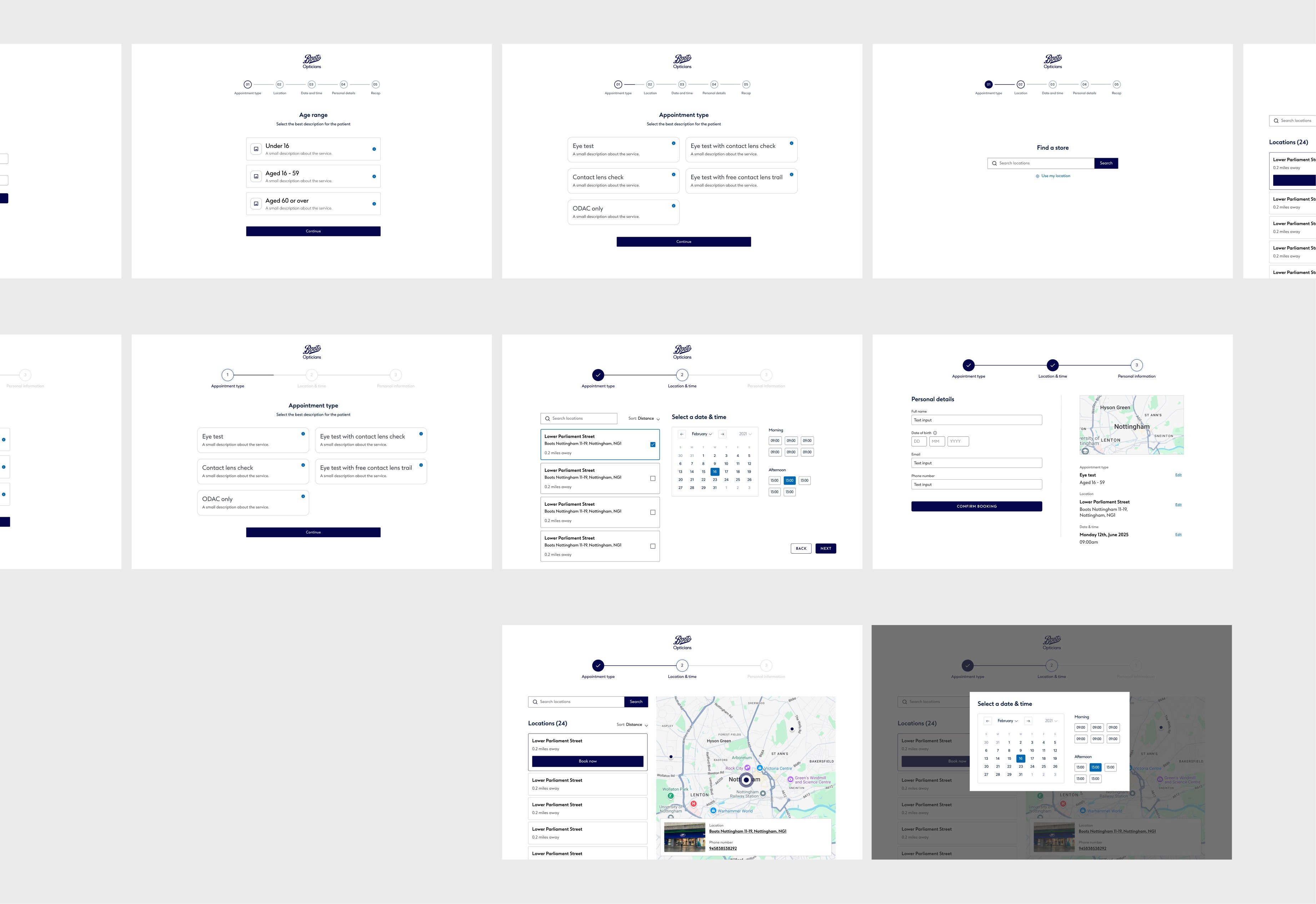
Progress Tracker

I introduced a clear progress bar at the top of each step. This gave users a visual sense of how far along they were and reduced abandonment caused by uncertainty.
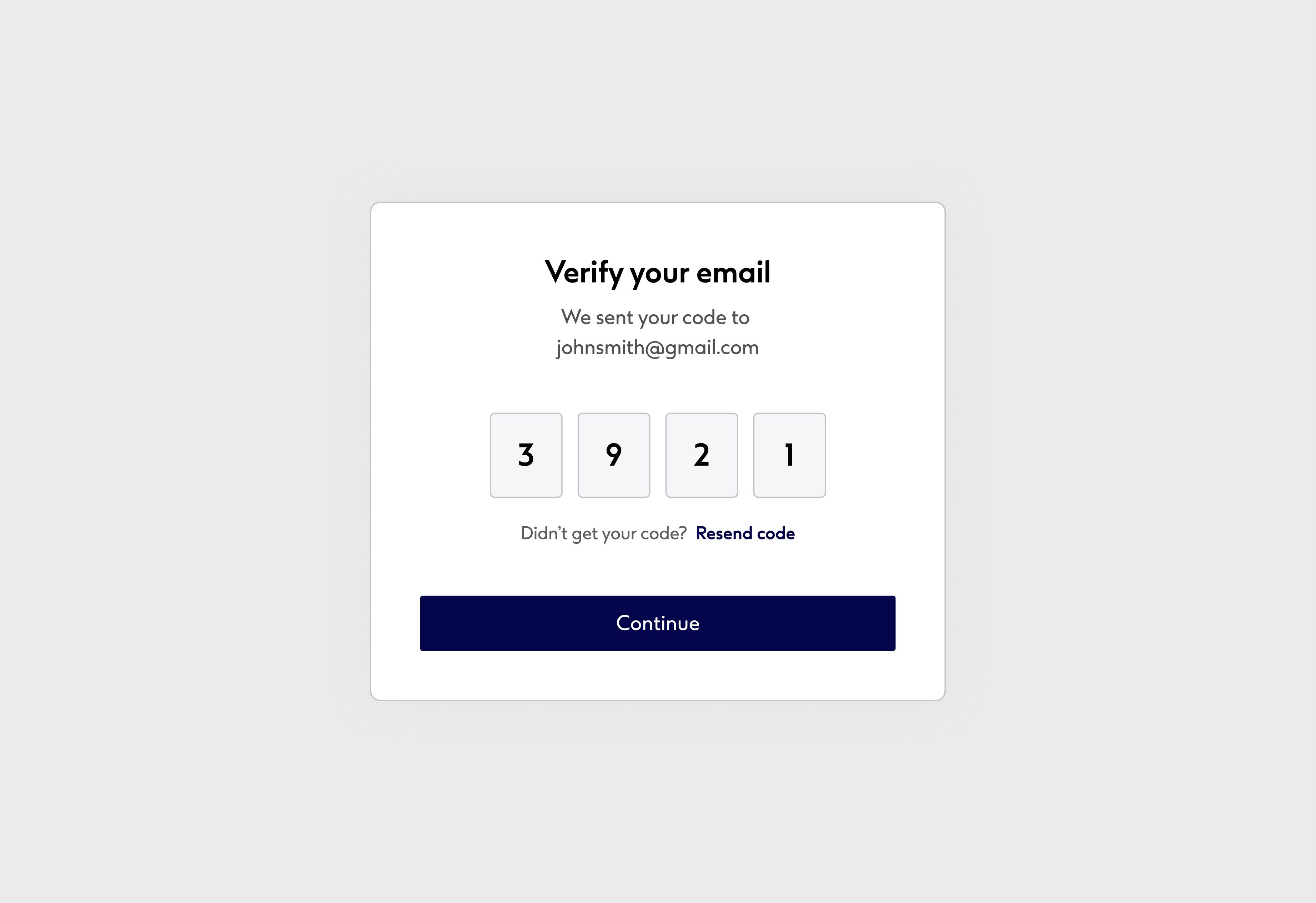

Hybrid Login Model

To reduce friction at login, I designed a system that allowed both account login. For users wanting access to history, reminders, and rebooking and confirmation code login for one-off users who didn’t want to create an account. This gave users full control over how they engage.


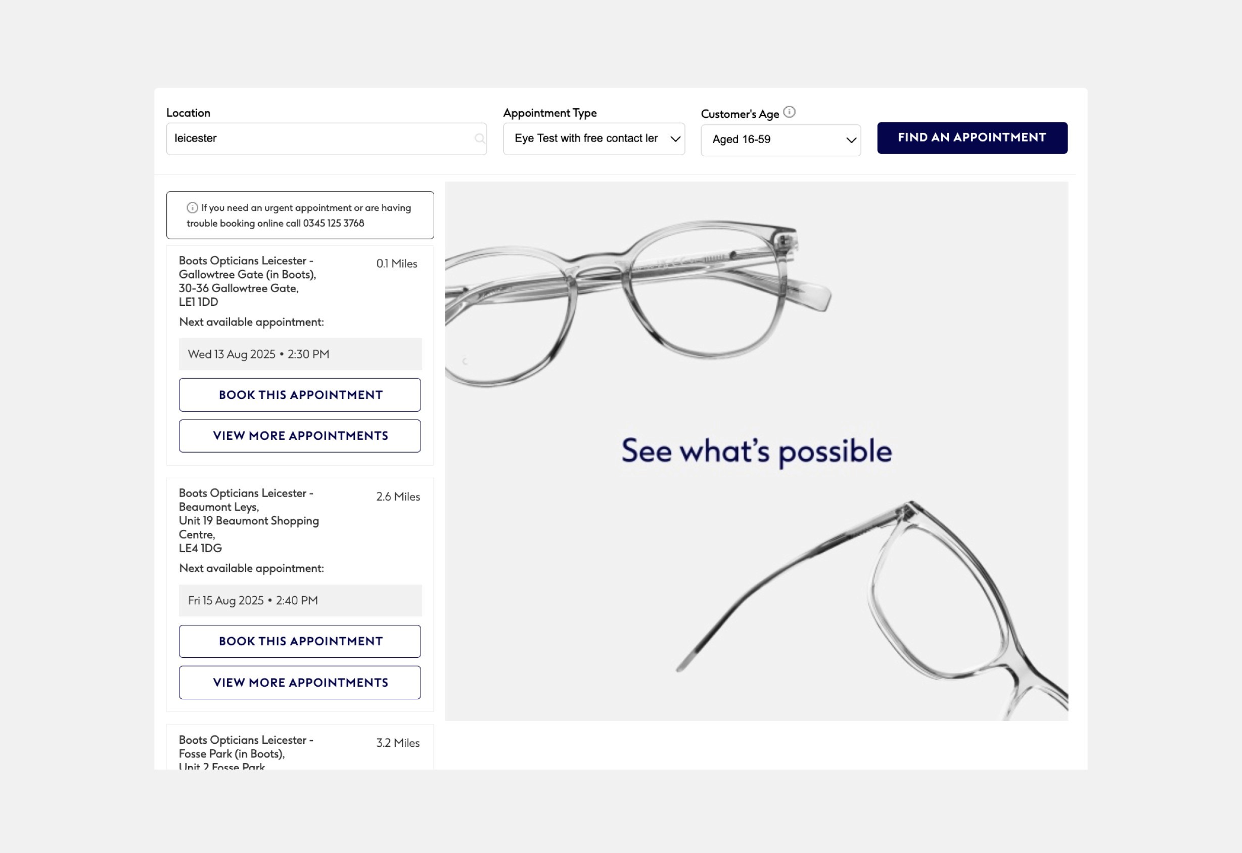
Store Availability Improvements

Availability is now shown before selecting a store, with filters for distance, earliest appointments and services available. I also added a preview of the next available time slot under each store card. This helps users make faster, more informed choices.


Mobile-First Layout

I rebuilt the journey with a mobile first approach ensuring larger tap targets, readable text sizes, clear CTA placement and reduced scroll fatigue.


Accessibility Enhancements

Designs were built to comply with WCAG 2.1 AA standards.

Evaluation

As the redesigned booking journey has not yet launched, evaluation will focus on setting a clear baseline and planning for ongoing measurement. Before launch, usability testing showed promising results, with users reporting improved clarity and reduced friction.


Post-launch, we will track key performance indicators such as:

  • Average time to complete a booking.

  • Overall booking completion rate.

  • Mobile vs. desktop completion rate.

  • Qualitative feedback via post-booking survey.

  • Drop-off rate between store selection and confirmation.

As the redesigned booking journey has not yet launched, evaluation will focus on setting a clear baseline and planning for ongoing measurement. Before launch, usability testing showed promising results, with users reporting improved clarity and reduced friction.


Post-launch, we will track key performance indicators such as:


  • Average time to complete a booking.


  • Overall booking completion rate.


  • Mobile vs. desktop completion rate.


  • Qualitative feedback via post-booking survey.


  • Drop-off rate between store selection and confirmation.

Smooth Scroll
This will hide itself!