Introduction
The goal was to design a new website that reflected Connected Kerb’s ambitious vision while ensuring a smooth, intuitive experience for users. The site needed to deliver essential tools, meet user needs, and integrate seamlessly with a simultaneous large-scale company rebrand.
This project required close collaboration with the brand team to ensure digital and visual consistency across all touch points.
The rebrand was happening in parallel, meaning brand guidelines were still evolving during the design process.
To align on direction, a workshop was organised with stakeholders to discuss market positioning, user needs, and design priorities. This created a shared understanding of both the brand vision and the functional requirements for the website.

Competitor Analysis
I started by analysing key competitors websites to understand what they were doing right and where they were falling short.
I looked at user experience, design, functionality, and engagement.
Visual Appeal
Many sites used clean, modern designs that were visually engaging.
Useful Features
Features like real-time updates and interactive maps were highly valued by users.
Slow Load Times
Several sites suffered from slow load times, negatively impacting user experience.
Lack of Mobile Optimisation
A few sites did not perform well on mobile devices, which is crucial for today’s users.
This competitor analysis helped inform my design approach, focusing on creating a seamless, efficient user experience while optimising for performance and accessibility.
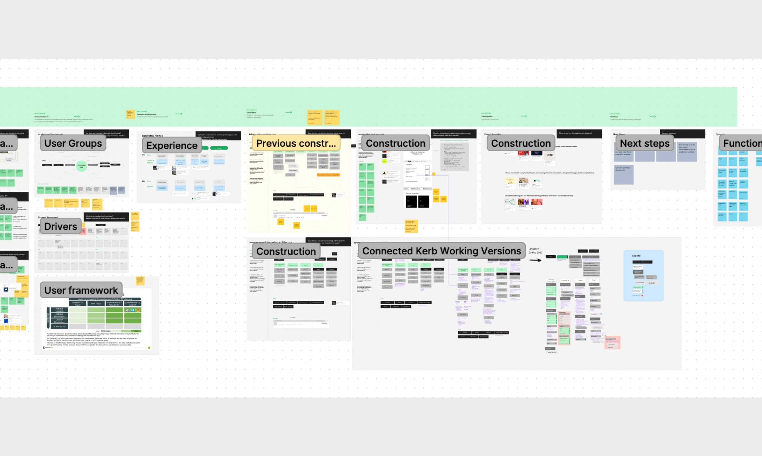
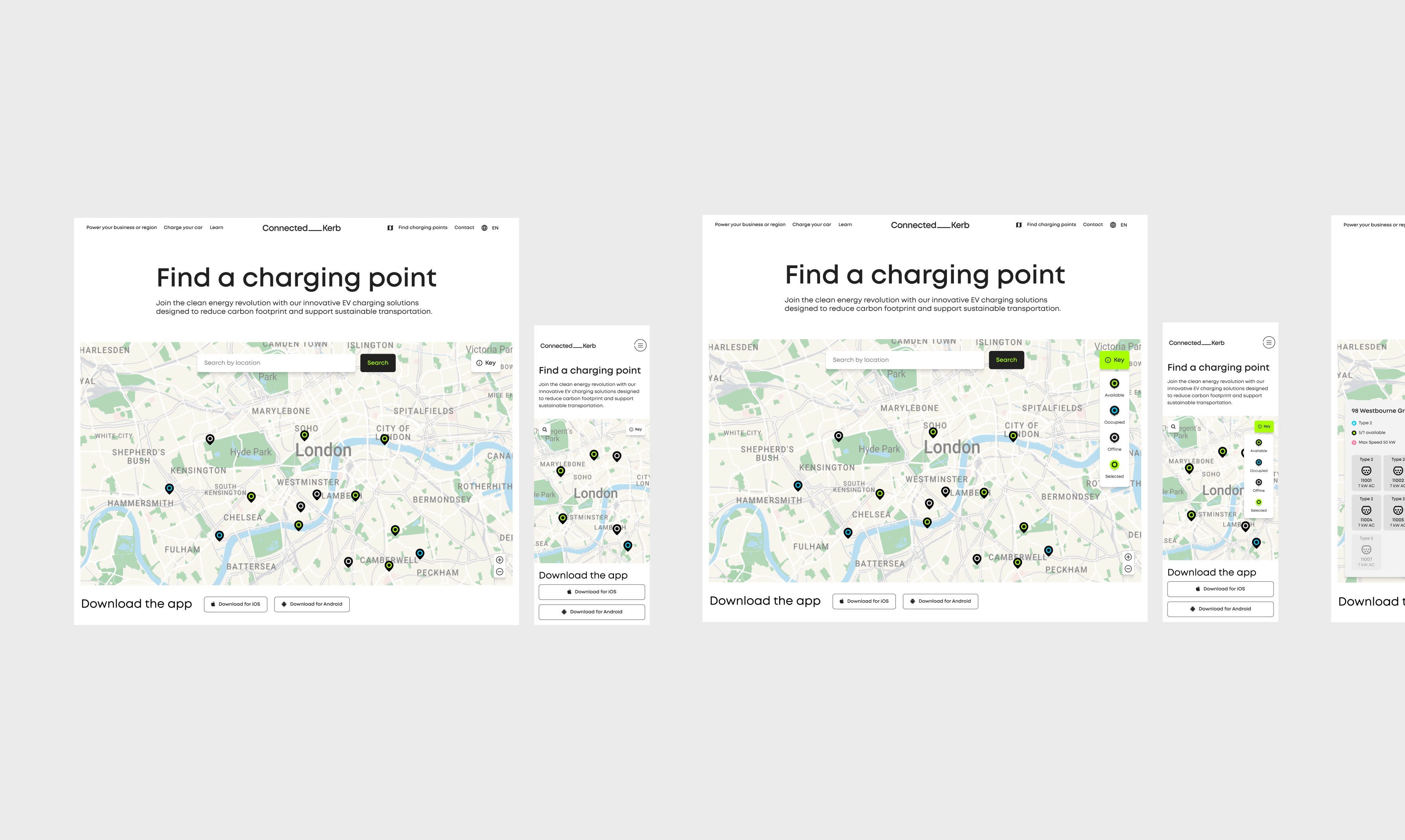
Wireframes
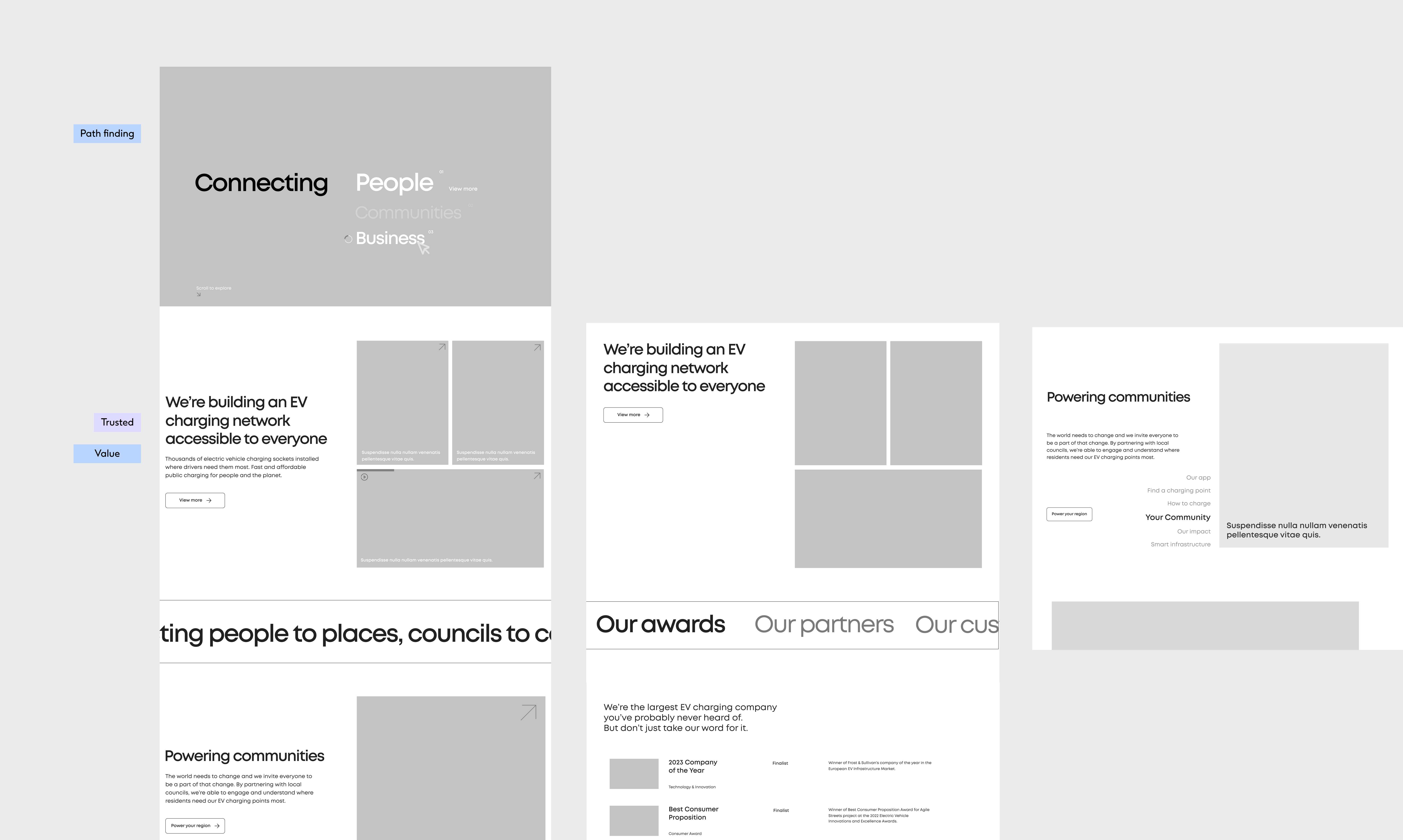
Design Direction
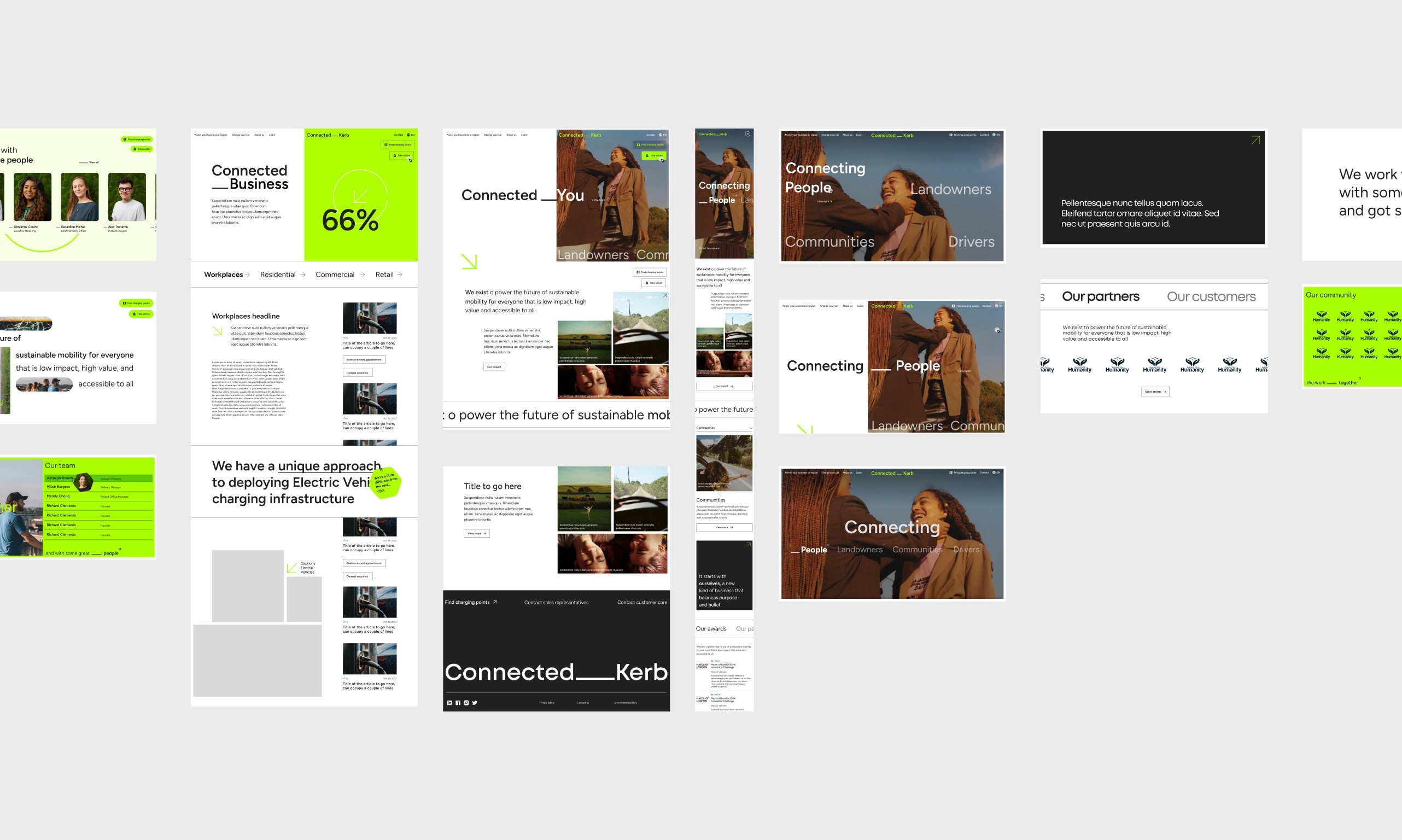
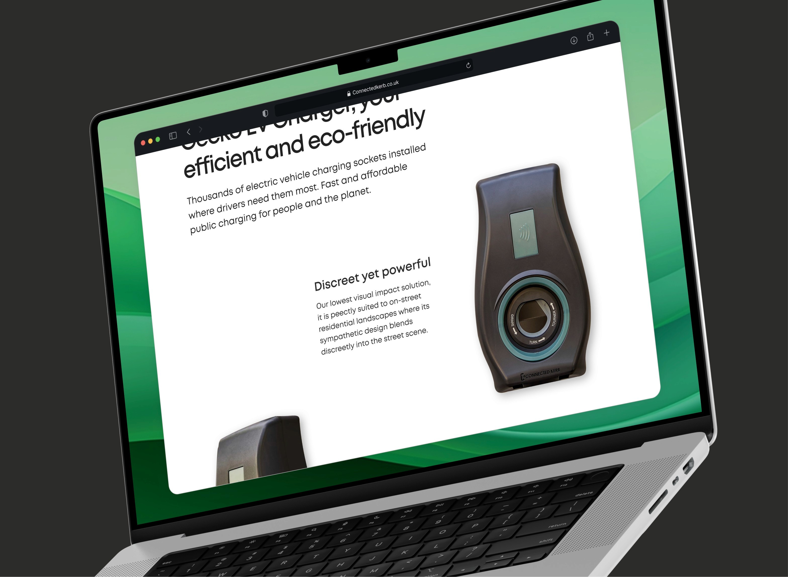
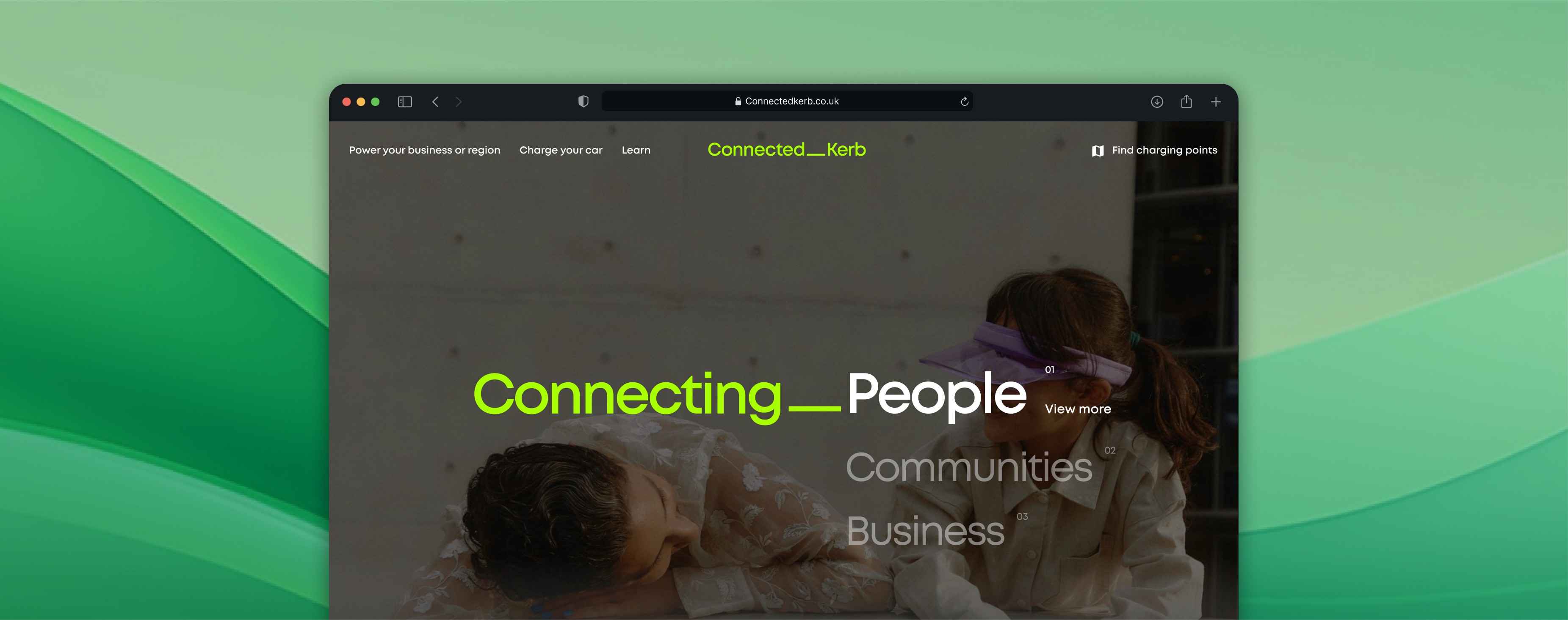
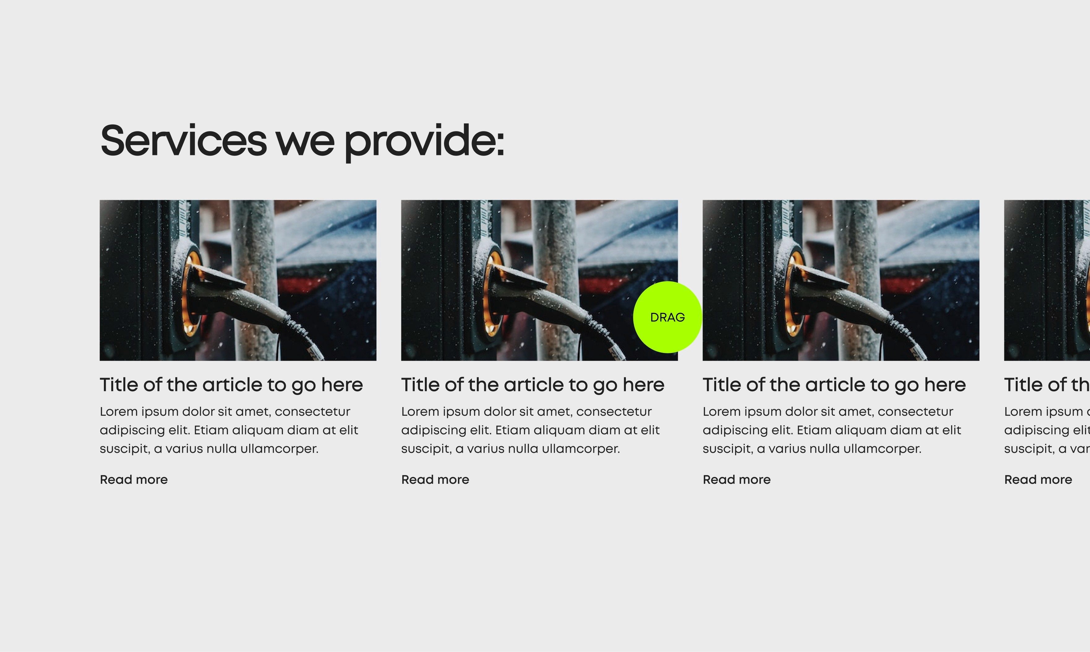
In response to the client's request for a balanced integration of their neon green colour on the website, an interactive cursor was designed to appear exclusively during drag actions. This approach ensured that the neon green element was incorporated without overwhelming the overall visual experience.
Collaboration
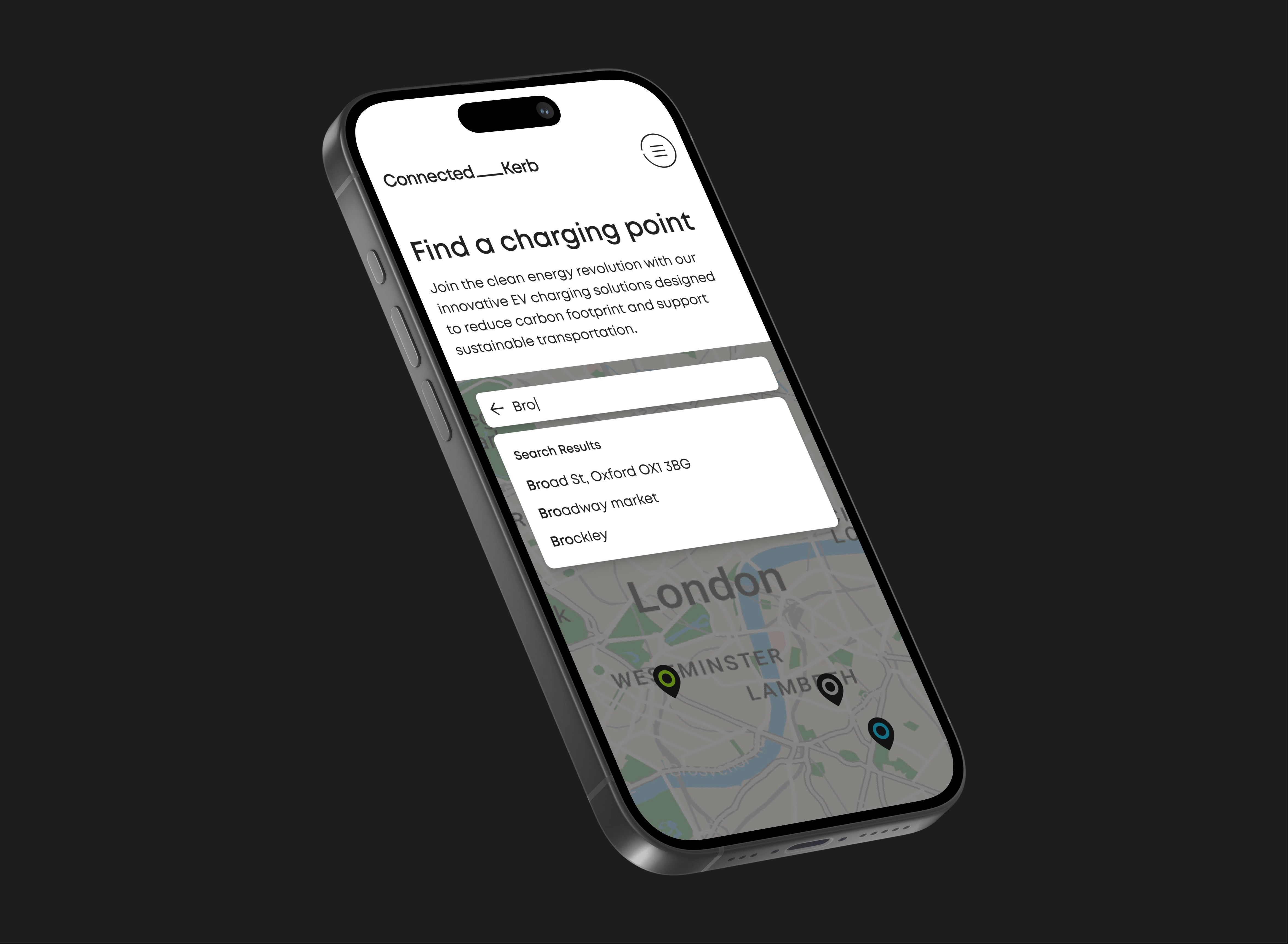
While working on the website, I needed to collaborate with an external agency responsible for developing the mobile application. It was crucial to co-ordinate with the agency as both the website and app required an identical map feature.
A client requirement was the ability for users to request new charging stations. I explored multiple entry points for this feature, ultimately designing a dedicated request form integrated into the site’s map flow. This ensured requests were valid, relevant, and actionable for the business.
Collaborating with an external agency presented its own set of challenges. There were instances where not all the files were shared with me, resulting in misalignment of designs when the team reconnected. To prevent this from happening again, we created a centralised file that documented all the UI elements to be used in the project. This ensured better co-ordination and consistency among the team members.
Ready For Dev
In order to facilitate a smooth transition during the handover to the development phase, meticulous care was taken to outline each feature with detailed notes. The objective was to provide a clear and comprehensive understanding of each feature, ensuring that nothing was left open to interpretation.

Evaluation
This project showcased the importance of tight collaboration during a rebrand, especially when multiple teams are delivering interconnected products. Balancing brand ambition with performance and usability ensured the final designs not only looked striking but also served the functional needs of users.